Branding & UI Design for ShitPapers
Shitpapers was founded with the intention of promoting environmental protection and sustainability. The papers were exclusively made by elephant dung in order to emphasise on the environment friendliness that the brand strives to achieve.
The branding for the company was created with these goals and the brand's personality in mind, while the UI was designed with a focus on branding while maintaining a premium look.
Branding reflects eco-friendliness with earthy tones and minimalist designs. The UI is premium, yet sustainable with careful attention to detail for a unique user experience.
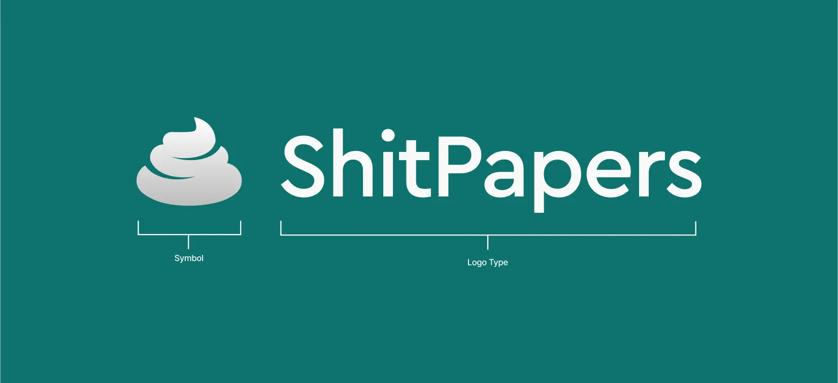
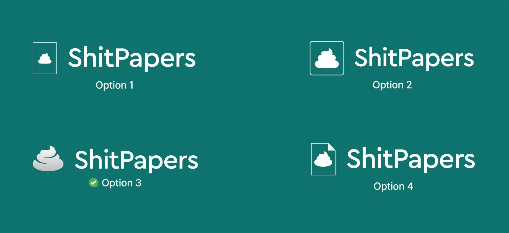
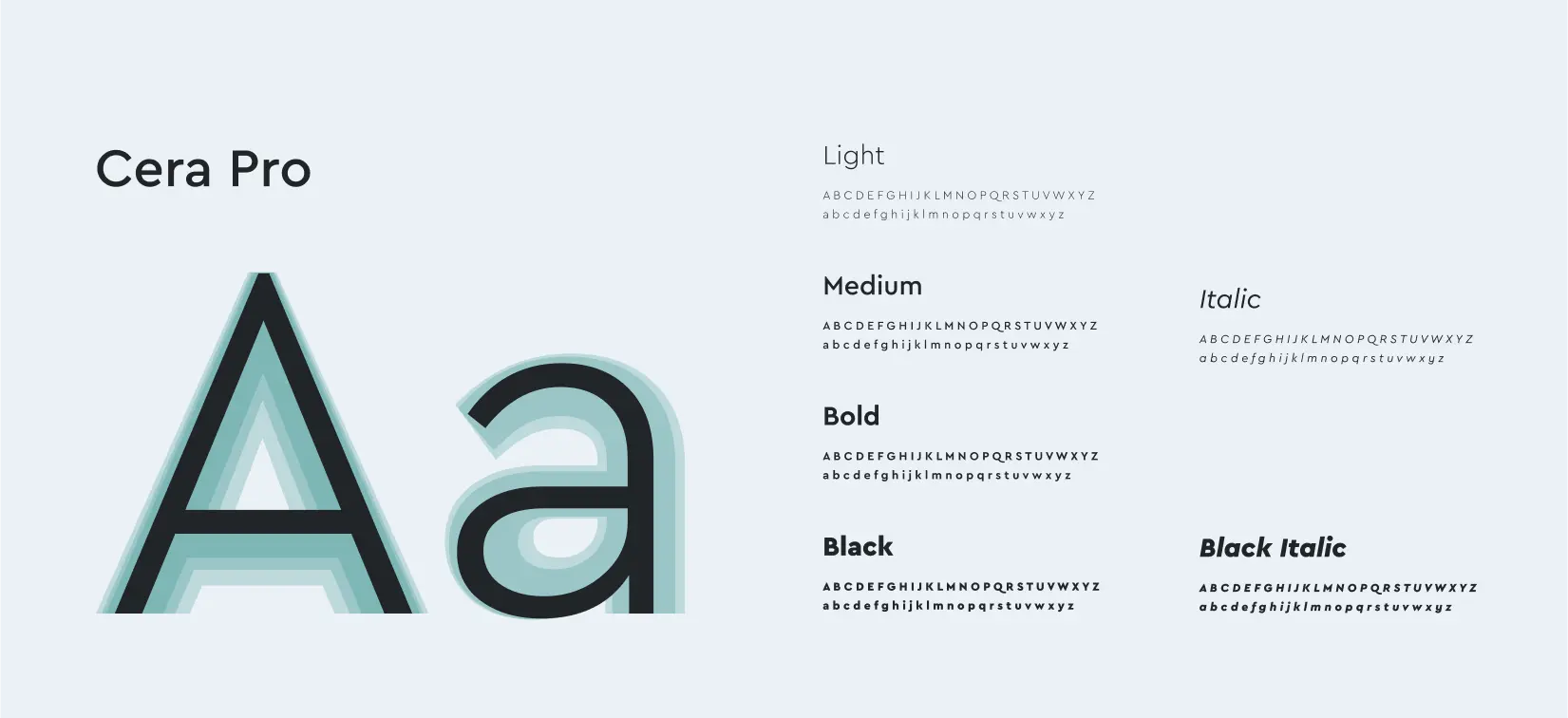
Cera Pro, a modern and geometric sans-serif font, was selected as the typeface for the Shitpapers logo, which also features Unicode's poop emoji. With its clean lines, legibility, and versatility, Cera Pro complements the overall minimalist and premium look of the logo. The font's use in the logo represents the brand's commitment to quality and sustainability, in addition to being a playful nod to the company's name.
During the ideation stage of the project, we created several options for the logo. After careful consideration and evaluation, the team ultimately decided on option 3 as the most suitable choice. This decision was made based on factors such as the logo's ability to represent the brand effectively, its versatility across different contexts, and its ability to appeal to the target audience.
As a modern and geometric sans-serif font, Cera Pro was selected as the main font for several reasons. Firstly, its clean lines and versatility make it a perfect choice for a minimalist and premium brand like Shitpapers. Additionally, the font's legibility is important for ensuring a seamless user experience across the brand's various touchpoints. The balance of geometric shapes in Cera Pro also adds to the overall aesthetic of the brand and represents its commitment to quality and sustainability.
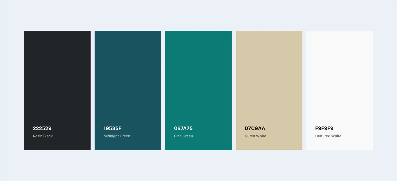
The goal behind the color selection for the project was to evoke the tropical landscape of Sri Lanka. Rasin Black, Midnight Green, Pine Green, Dutch White, and Cultured White were chosen to represent the rocks, sea, forest, sand, and white sky, respectively. These colors collectively create a cohesive visual identity that accurately represents the brand and its unique offerings.
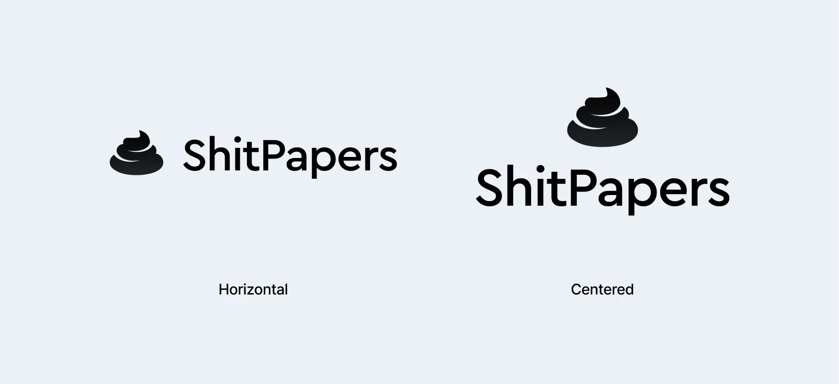
To ensure versatility and flexibility in the brand's visual identity, the Shitpapers logo was created in both horizontal and centered versions. In addition to these variations, the logo also features different color options that complement the brand's color palette. By offering a range of logo variations, Shitpapers is able to maintain a consistent brand image across various touchpoints while also adapting to different design contexts.
User Interface - Proposed Solution
The main objective of building the e-commerce platform was to provide users with a seamless and hassle-free customer journey. The platform was designed with a focus on providing users with a premium and luxurious experience. By incorporating features and functionalities that prioritize user convenience and satisfaction, the platform enables users to shop for products and make purchases with ease and confidence.
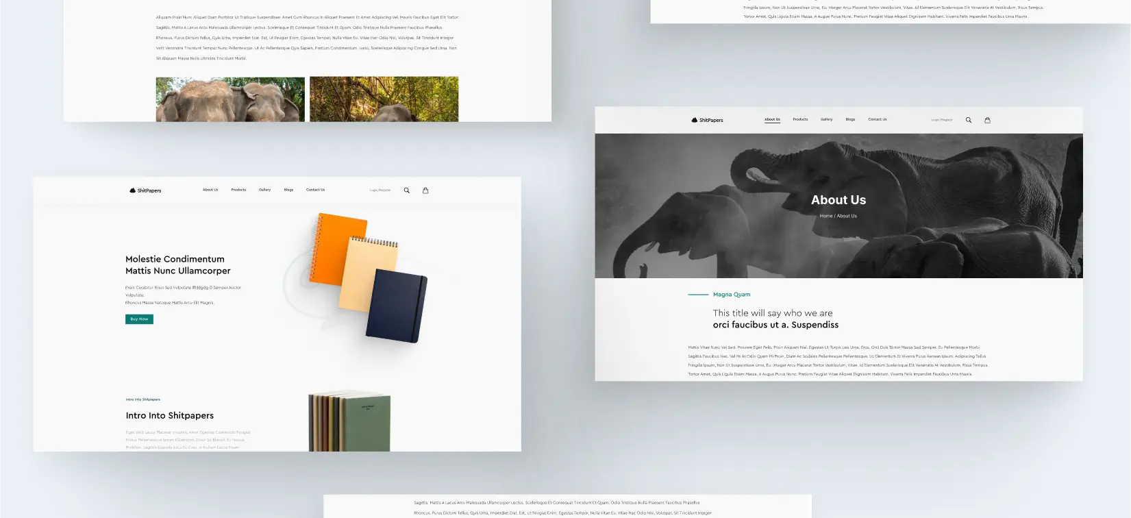
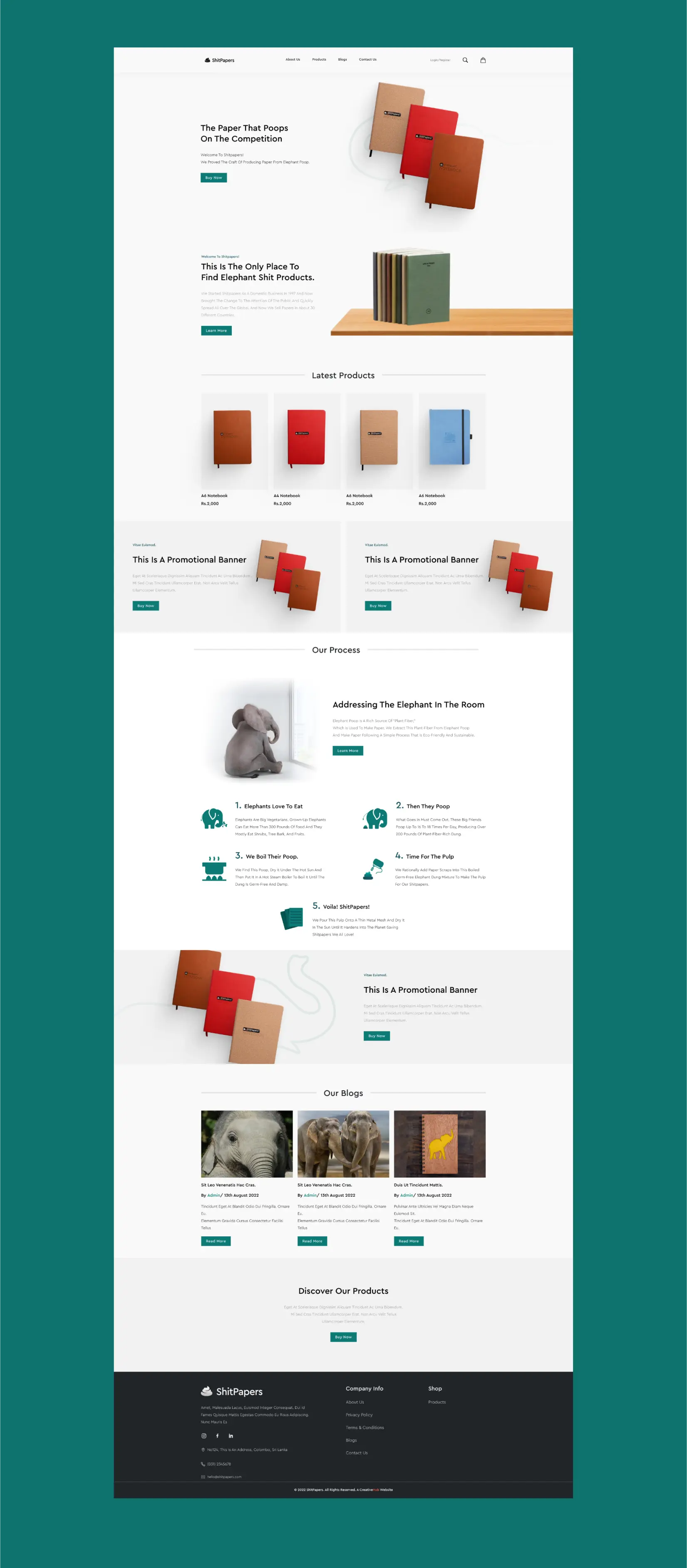
Homepage
The Shopify homepage was designed with the customer at the center, with a clear focus on showcasing the brand's eco-friendly notebooks. In addition to highlighting the products, the page also includes an illustration of the notebook manufacturing process, which emphasizes the brand's commitment to sustainability and eco-friendliness. By providing an engaging and informative browsing experience, the homepage effectively communicates the brand's values and unique offerings to potential customers.